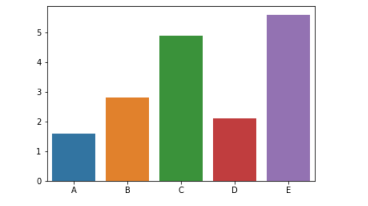
There are many different types of charts and graphs that can be used to represent data, so how do you know when to use a bar chart? A bar chart is a graphical representation of data that uses bars to compare different values. Each bar in the chart represents the value for a particular category or unit of measurement. The length of the bar corresponds to the magnitude of the value. Bars can be horizontal or vertical, and they can be displayed as either discrete or continuous data.
Not to mention, there are also several types of bar charts, including column charts, stacked column charts, and 100% stacked column charts. These charts are often used to display comparisons between two or more items, such as sales totals for different products over time. They can also be used to compare proportions, such as the percentage of people who responded to a survey question in each category. Keep reading to learn about the different situations when a bar chart would be the most appropriate way to visualize your data.
How to Create a Bar Chart
To create a vertical bar chart, draw a table with one column for each item that you’re comparing and one row for each data point. In each cell in the table, write the value for that data point. Then use these values to create your bar chart by drawing bars above the column headings in your table (the taller the bar, the higher that value). To create a horizontal bar chart, draw a table with one row for each item that you’re comparing and one column for each data point. In each cell in the table, write the value for that data point. Then, use these values to create your bar chart by drawing bars beside the column headings in your table (the wider the bar, the higher that value).
Highlighting Differences Between Items
A bar chart is used to compare and contrast items by showing how they are different. It can be used to compare things like the heights of people, the number of students in each grade, or the sales figures for two products. The bars on a bar chart can be either vertical or horizontal, depending on what you want to compare. When making a bar chart, you first need to decide what you want to compare. Then, you need to gather data for that comparison. For example, if you want to compare the heights of two people, you would need their heights measured in inches or centimeters. Once you have your data, it’s time to create your chart.
Tracking Changes Over Time
A bar chart is used to track changes over time, compare values between groups, and find the median and mode of a set of data. It is a graphical representation of data in which the width of each bar is proportional to the magnitude of the data item it represents. For example, you may want to see how many people in your city have diabetes from year to year. By using a bar chart to track this data, you can easily see how the number of people with diabetes has changed over time. Or you may want to see how the amount of money you make each month has changed over the past year. By using a bar chart to track this data, you can easily see how your income has changed over time.
Summarizing Data From Surveys
When data is collected for a survey, it can be difficult to summarize and gain insights from the information simply by rifling through different responses. Your best bet is to use a bar chart in order to simplify and summarize the collected data. Highlighting different categories and bar heights, it will be a lot easier to understand different elements of information. The summary statistics can be translated into visuals that will be easier for users to comprehend.
A bar chart is a great way to compare different values, especially when you want to focus on the overall trend. For example, you might use a bar chart to compare the sales of different products over time.

